Showing posts with label Layout. Show all posts

Saturday, August 16, 2014

Perler Bead fun

The past couple of weeks I have been working on scrapping photos from our Disney trip more and more often I have found myself wishing for a certain embellishment, those fun little enamel dots.  Not something I would normally use, but for some reason I have been loving that little extra pop of color on my Disney pages.  Not having an endless supply of enamel dots or an unlimited budget to purchase them, I turned to a project I have been wanting to do for awhile.  DIY enamel dots!  Perler beads and an oven-easy right?

I know this has been done by others before me, but I have been wanting to try this forever and what better time than when hubby is out of town and perler beads are on sale at the local craft shop.  Supplies needed: Perler beads (I got a great multi pack at Joann's), Parchment paper, oven.  I would recommend using a toaster oven, I used a little craft oven from a thrift shop I use for polymer clay, but you can use your oven if you don't have a toaster oven-I just recommend cleaning it after using it for enamel dots.

Line your baking sheet with parchment paper and line up your perler beads with the holes facing up


 Bake at 350, mine took about 20 minutes, some of the darker ones took a bit longer.


Halfway through, you can see the holes filling in.
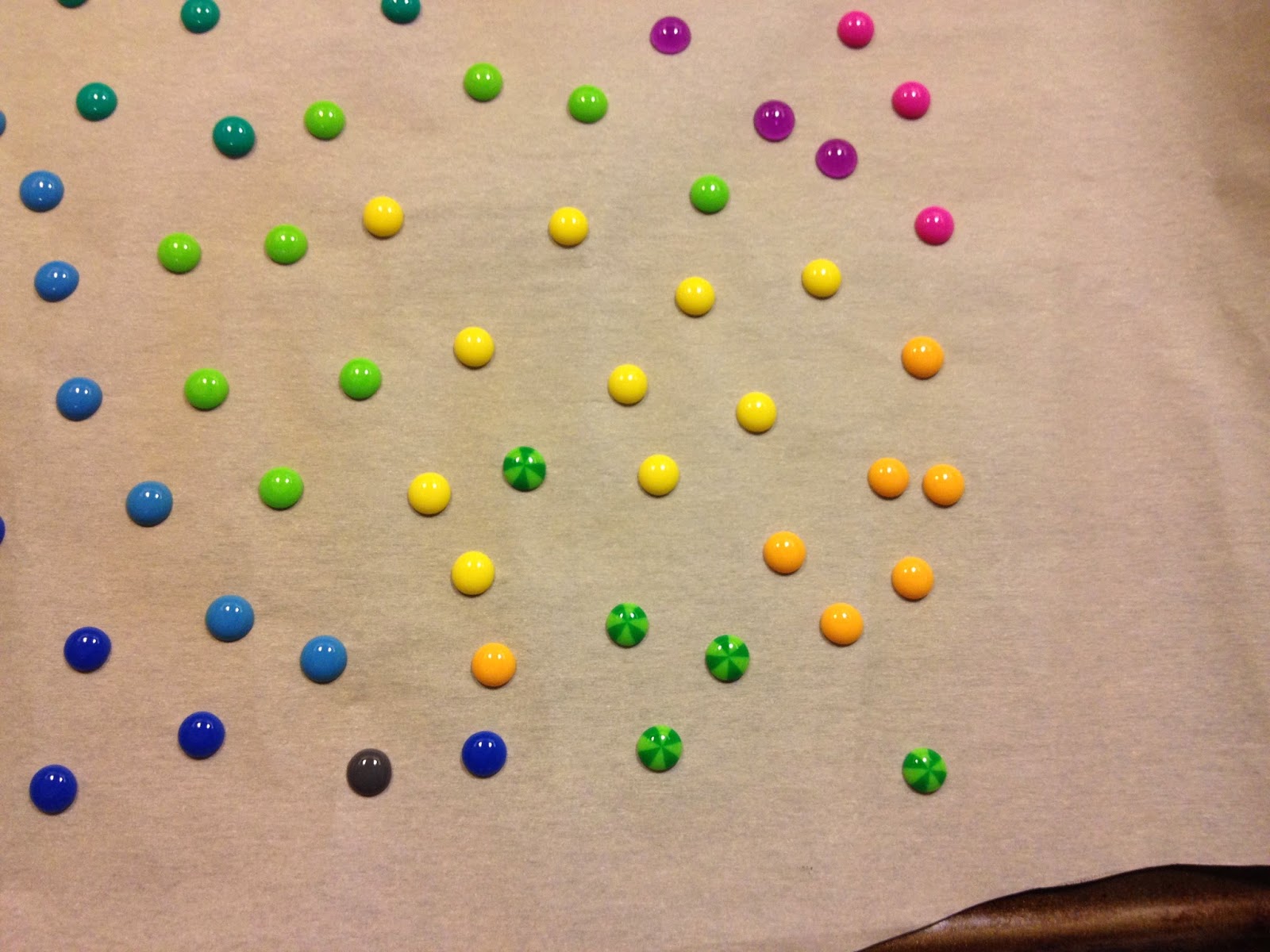
Done!  They turned out so cute, and I love that the striped perler beads look like little beach balls.


Beautiful colors and they look so similar to the ones I have already in my stash.  So excited to try this with pony beads for a larger enamel dot.  

I don't use bright colors in my pages very often, so most of the enamels in my collection are neutrals and more darker colors, but I have been using a lot of brights lately, I love that I now can make almost any color I need!


I like the little pop of color they add to pages, and the variety of colors available make it easy to find the right color for your project.


Thanks for stopping by!

Sunday, April 6, 2014

Back with a splash!!!

And a spritz...

Some of you may know that my beloved Archiver's closed its doors on February 15th.  And while it has been very sad that it is no more, I am grateful for the experience, along with all the forever friends and crafty knowledge I have gained from this wonderful place.


On the bright side I have free time again!  Which means I have finally been catching up on all of those projects piling up in my craft cave.

One of the biggest perks to not running from one job to another has been getting to try all those new products I obtained from Archiver's.  Like the new(ish) Naturally Aged paint systems from Tattered Angels.  I had played around a bit with them prior to this, but only in demos and have been sitting on several sets now since they came out.

The one I was most anxious to use was the Weathered Copper set, gorgeous!  I have a couple of projects to share all using this set.  

The first is a page I've been sitting on a for quite a while.  The papers are from the Kaiser Craft's Miss Empire line, I fell in love with the colors and the designs and the print is one of my favorite art nouveau prints.  

I had the photo mat done first and a rough idea of how I wanted the final page to look like, but I just couldn't get it to the next level.  In the end I did some splatter painting with turquoise paint and some drops of coconut glimmer glaze just to give it some color.  

As I was playing with the Weathered copper tattered angels set it hit me that this was exactly what I wanted on my page.  The circle frame I used on the page is a pressed paper frame from Heidi Swapp and it was perfect for the glimmer mists.  A couple of feathers tucked behind and I was finally happy calling it done!


After finishing spritzing my frame I had a lot of left over color on my craft sheet.  Normally I keep a mop up tag so I wont waste any color, but because of how the colors are layered I wasn't sure how well they would look when I cleaned them up with my tag.  However, I almost love the end result on my tags more than I did on my actual attempt! 


Watch for more details and photos about this tag, and a tutorial on how I did the bird using some other fun new products I've only just started playing around with!  

Wednesday, May 8, 2013

Happy NSD...a bit late

Hello my lovelies!  I hope everyone had a wonderful national scrapbook day!  I know I certainly had a great time holed up in my room playing along with challenges over at scrapbook.com.  Although I am still trying to get used to that new format of theirs!

I wasn't able to get to all of the challenges they had to offer, but I did complete three pages that I am very happy with.  It was so nice that they were all day challenges, it really gave me a chance to create something I actually liked, versus last year I was so stressed about just getting them done I ended up salvaging every page I did for parts after the challenge was over.

The first page I created was for the sketch challenge, the original sketch can be found here.  Honestly I wasn't feeling it at first, but once I found the photos I wanted it just fell together and I'm loving how it turned out! 

I used the new Bo Bunny Trail Mix collection which matched photos from the RenFest perfectly.  I distressed and inked all edges and I couldn't resist doing a bit of fussy cutting although in the interest of time I had to go easy!  I have been playing with perfect pearls lately and I used a combination of colors on the chipboard bird. 

This was for the negative space challenge which was to cut an image out of your paper and use the negative image rather than the cut.  I chose to use a photo of my great great grandparents, it just worked so beautifully with this paper line.


I did a bit more fussy cutting on this one, cutting around one of the tags from the paper pack to add a decorative frame along two sides of the image.  I was very happy how it looked with the Prima flowers I used.  I'm waiting on the exact spelling of names before I add journaling and a title.

The last page I did was for the Instagram challenge, I had just gotten these photos of my niece picking out her first 'very own' pet.  She had a wonderful time at the 'fishy store' picking out her new goldfish and was so proud to show them off!


For those of you who know me really well you know I don't enjoy working with bright colors.  But I really liked this line from Crate paper, I think it helped that the colors were a bit muted and the paper has a great texture which was very fun to work with.  While I didn't ink anything I couldn't resist pulling out my acrylic paints to stamp with bubble wrap on the background.

Coming up-the week long challenge!  I have my mini album, my papers and a free evening...I cannot wait to get into my room and start creating! 

 Happy scrapping all!

Sunday, July 15, 2012

Round two

Between the hustle and bustle of the 4th and then getting back into the swing of things at both Archivers and my big girl job after being gone for almost a week, this last week has just flown by!  I'm currently waiting to head out to Archivers to teach a class this afternoon, it is that annoying time before you head to work, it is too early to actually leave for work, but to late to really do much without being stopped at the half way point to leave for work-so I thought I'd share with you (finally) the next round of pages from my completed memorial album for hubby's coworker, Laurie.  Her daughter passed away of an unexpected asthma attack just a few days after her 14th birthday.


 Thanks for taking a peek and I'll be back with the last group of pages, hopefully tomorrow.  Stay cool everyone!

Sunday, May 6, 2012

Close only counts in horseshoes and hand grenades...and blog give aways!

I hope everyone enjoyed their National Scrapbook Day yesterday!  Sadly not a lot of scrapping was done by me yesterday, my husband's Grandfather was admitted to the Mayo clinic on Friday with fluid around his liver.  I couldn't get off work so my husband went to be with his family and left me alone.  I needed a distraction and had little desire to be alone, so when Archiver's called and asked if I could help out I gladly volunteered.  It definitely took my mind off of things and made the waiting a little easier.  The outlook doesn't seem very bright, but we will just continue to hope that he lasts a while longer.

Now I was hoping to make it to 35 followers, and unfortunately that didn't happen-but I decided to move forward with the give away anyway!  So with the help of random.org please join me in congratulating the winner of the Spring Seasonal Distress inks..

Andrea Slee!!

Andrea, I will be in contact with you shortly to get your address for new inks-congrats lady!

Now onto what I was able to get done this weekend!  Saturday evening my hubby wanted to be left alone so I worked on a page for the Round Robin challenge over at sb.com.  I had to choose a page from NMscrapper's gallery to lift and I opted for her page 'My Dad'.  There was just something about it that seemed to work with the photos I wanted to scrap.  

This was also done for the 'Getting Messy D.I.Y. Style' challenge over at Stay True to God, and for the first week of the Spring Splurge challenge at sb.com.  This week's challenge was bling.  It was made using papers from the April Scraps of Darkness kit and is the first in a two pager for my sister's wedding album-I'm hoping to have it done in time for their 10th anniversary next year!


I just think my sister looks so beautiful in these photos, just classically elegant.  And her wedding colors worked so well with the papers in the kit.  


The damask papers and Zva flourish are from the April kit.  And the flowers were made using this tutorial.Because the paper was already mulberry I didn't emboss it to avoid tearing flowers as much as possible.    

The getting messy challenge on STTG required you to use either a homemade textured background using something like modeling paste or a handmade flower.  Creating the entire background was a little intimidating for my first time out using modeling paste, and since I had the handmade flowers already, I opted to just play a bit with my paste and created the two black flourishes using black acrylic paint, modeling paste and a Prima mask, and I just love how it turned out!


The paste gives so much texture, and I was pleasantly surprised at how well the mask kept its shape after slopping paste all over it with my palette knife!

Thank you everyone for playing along with me on my give away-I truly appreciate the support-happy scrapping!

Monday, April 30, 2012

A new layout and contest!

Good morning friends, before I show you my latest creation, I'm super excited about national scrapbooking day which is coming up on Saturday May 5th!  It has always been one of my favorite days in the scrappy world, next to ScrapFest and CHA previews.  And to celebrate I'm having my first ever give away!

If I can make it to 35 followers by Saturday I'm giving away a new Tim Holtz Spring Seasonal Distress ink collection!


I got my collection yesterday and I have to say I'm in love with the colors already!  Now how do you win this fabulous prize?  Leave a comment on this post and let me know that you're following! You must be a follower and comment to be eligible. Winner will be chosen at random from those who comment and are followers the evening of Saturday May 5th!

Now onto the my latest little project.  This past fall my mom and I went to Cavalia in Minneapolis, a fabulous cirque du soleil inspired equestrian show, and it was just amazing.  The end of the first act culminated in the most amazing display of Roman riding I've seen in quite a long time.

Photography wasn't allowed during the performance, so I must thank google image search for this photo.  The page was created using the March Scraps of Darkness kit, which was full of the wonderful Graphic 45 Olde Curiosity Shoppe papers and a beautiful sketch by suepup.


I did a lot of fussy cutting on both the butterflies and the bg paper. The diamond paper is actually the second side of the outer background paper, but because I loved both sides so much I had a hard time deciding how to use it.  So I cut the bg paper to form a frame and gave it a slight mat using CS allowing me to flip over the center portion of the paper to complete the background.  The whole made from fussy cutting out the roller skate is hidden behind all the layers.

Then I just added in a bunch of the various boarders and tags from the collection.  The title was from the Graphic 45 Olde Curiosity Shoppe's alpha sticker sheet and it was mounted to cardstock.  The peacock feather was a gift from Brooklyn Scrapper-thanks lady!

So I hope to see you all entering my contest and happy scrapping!

Sunday, April 22, 2012

Mother Earth

In honor of Earth day I wanted to post this page created for the Darker Side challenge over at  Scrapbook.com.  The theme this month was 'earthy' and the first image that popped into my head was a greek goddess type figure.  This image was found at my favorite artwork website The Sum of all Crafts.


To create the background I first distressed the edges with water, black soot distress ink and a scissors for the deep tears.  Once dried I stamped the paper with bubble wrap and a mixture of brown and gold acrylic paint.  I than masked with the negative image of the Tim Holtz Branch Tree bigz die. 

 After the background was complete I printed the image on tissue paper and adhered it to the background with matte gel medium.  To prevent the image from smearing I reversed it prior to printing so the ink was on the backside but my image still faced the direction I wanted.  

Once everything was dry I added the leaves and metal butterfly from Graphic 45 and spritzed the entire page with heirloom gold Perfect Pearls.  The title used the same paint as the background and was done using Tim Holtz grungeboard letters.  'Earth' was made using a BoBunny alpha sticker sheet from the Et Cetera line.

Thanks for stopping by to take a look!

Thursday, April 12, 2012

Nouveau

I love the French art nouveau prints, the colors and images are so rich and beautiful-and I'm just drawn to this advertisement for Taittinger champagne featuring the image of Grace Kelly, it is just so classic. And when I saw the colors for this month's challenge over at Stay True to God (check it out here!) I thought the colors of this image would match perfectly.

This month I opted to do the level three challenge again which entailed using the 5 challenge colors (sunflower, butterscotch, auburn, rosy red and rosebud pink) with black. Four embellishments (Roses, Velvet, Chipboard, Canvas or Metal). Four textures (embossed, wrinkled, torn, crackled, puffy paint) and one technique out of the tutorials listed on the challenge page.

I painted the chipboard frame black before embossing it with vintage photo embossing powder. I rubbed off any excess powder after heating it and inked over it with black soot. I then painted over the entire frame with matte mod podge.

The red paper was stamped using tissue paper and black soot ink using Wendy's stamping tutorial. I really like how it turned out and plan on using it again in the future. The dress form was a chipboard shape that was stained with black soot distress stain and covered in glossy accents. I added a metal bead in the center of the large flower and used a velvet ribbon under the title.

The images in the frame are some of my favorites from the art nouveau period scaled down to fit the frame.

This is also for the Feeling French challenge over at sb.com using three French elements from a given list, Eiffel tower, french food (or in this case French champagne) and a fler de lis. Overall I am extremely happy with how this turned out!

Saturday, March 17, 2012

Feeling French?

Good morning everyone! I'm in sunny Kansas City this weekend visiting my darling niece Avalee! She is such an energetic little girl, and so adorable! This is Ava with her 'dampa' at my parents' house this summer-such a sweet heart! So before our little tornado wakes up I've got a little amour to share with you. This page was created for a couple of challenges over at scrapbook.com, the Feeling French challenge and the Round Robin challenge. For the Round Robin I lifted Pat's (GentlewoodFarms) layout 'Bruce Almighty'. Check out the original!

The Feeling French challenge required you to choose three elements on a set list of elements to use, I opted for lace, the Eiffel tower and a french phrase. And I used my absolute favorite line of Prima paper 'Moulin Rouge'-if I could find a couple of full sets of this I'd definitely snap them up!


The photo is of my sister and her husband on their, you guessed it, wedding day. They had this gorgeous vintage Rolls Royce to bring them to the reception, and I just loved this photograph, it just has a classic feel to it which I felt worked quite well with the Prima line.

The flocked rub-on plaque behind the title is actually the leftovers. If you've ever used this product you know that once you've used the rub-on there is an outer layer of flock on the plastic backing which leaves a gorgeous negative image. Just trim the plastic as close to the flock as possible and you have a fabulous new embellishment to use!

I hope everyone has a fantastic Saint Patrick's Day!

Monday, March 12, 2012

Memories

This is a page I created for a challenge going on over at Stay True to God, they have three amazingly generous RAKs to give out so take a peek here! I opted to try go for level three which meant using all four colors, (lavender, ice blue, cream and grey), three embellishments (flowers, bling, pearls or lace) one shape (damask or diamond) and one technique (one of three stamp tutorials or handmade flowers) and this was my final result! Oddly enough it turned out exactly the way I pictured it in my mind from the beginning. A rare occurrence I can assure you!

I've only used three sheets of paper for this entire page, including all of the handmade flowers. The blue paper and grey papers are from My Mind's Eye 28th Street Market from Michaels and I used a sheet of Basic Grey's Little Black Dress line with the damask shapes.
I handmade all the flowers using the Tim Holtz tattered florals die and the Regal Flourishes texture fade. Using this tutorial I posted in my first post. I topped them off with various bits of bling and pearls while tucking some crystal and pearl flourishes randomly throughout.
The colors turned out to be a bit harder than I anticipated, at least the lavender. It turns out I am not a big 'purple' person, so I opted to add it as an accent color. Mainly in the form of the milled lavender distress ink and acrylic paint.
I used a Melody Ross chipboard tag which I sanded down, primed, re-sanded, painted blue with Martha Stewart's Pearl acrylic paint in Jet Stream. I edged it in lavender acrylic paint and used my finger to add a grained look.

Thanks for stopping by and remember to check out the challenge over at STTG!